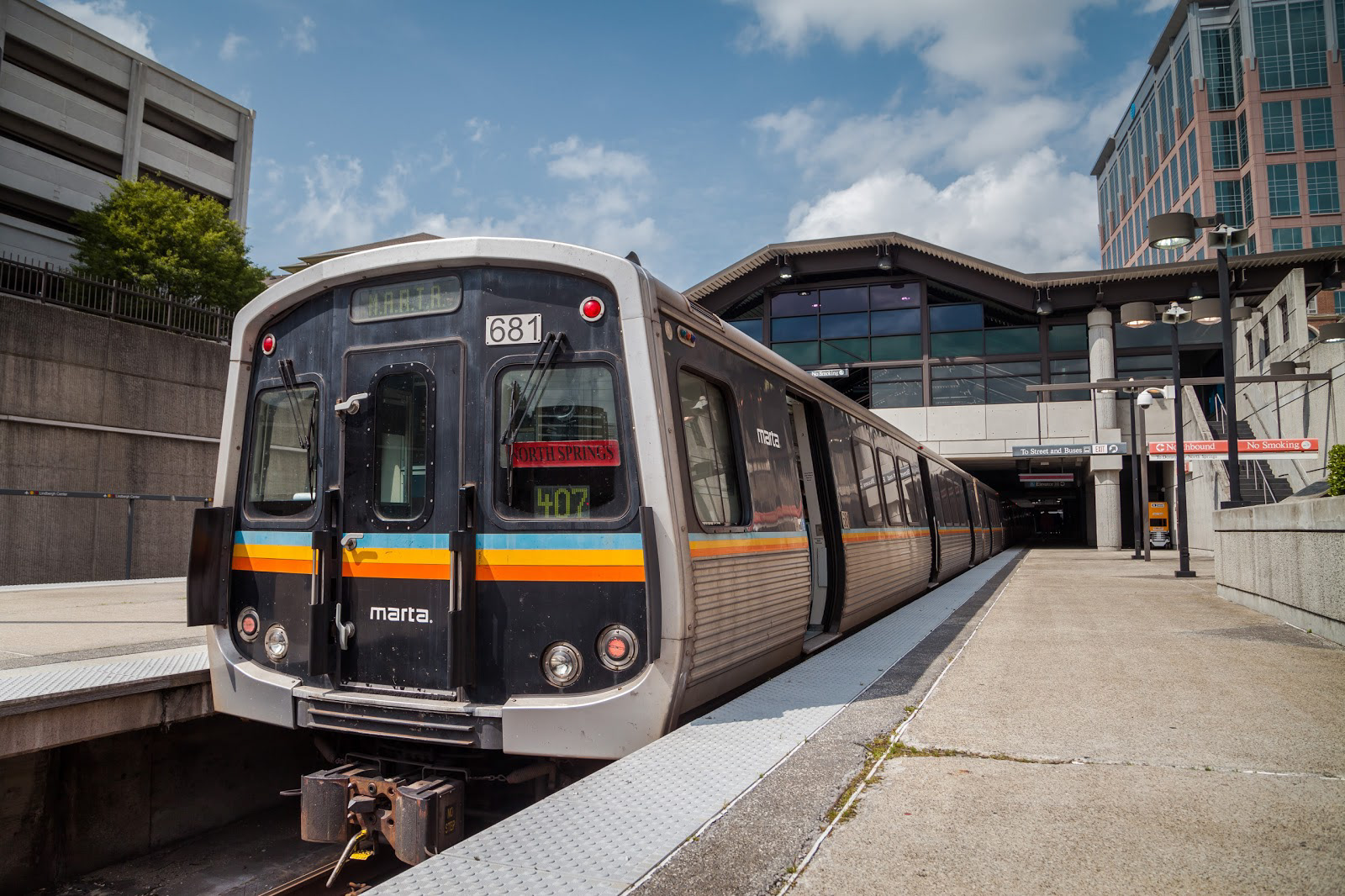
MARTA has been disparaged by Atlanta residents for years for being an outdated, difficult, and ineffective public transit system. Design modifications improve MARTA without completely walking away from their identity.
Revised Logo & Color Palette
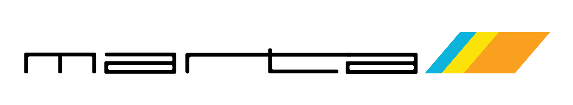
The revised MARTA logo includes elements from the the original logo to create a sleeker, more streamlined identity. The logotype features thinner, connected characters to demonstrate movement. Additionally, MARTA's signature rhombus shape is reflected and altered in order to further imply speed and motion. Color palette modifications introduce brighter hues for a friendlier, more inviting and lively colorway.


Map Redesign
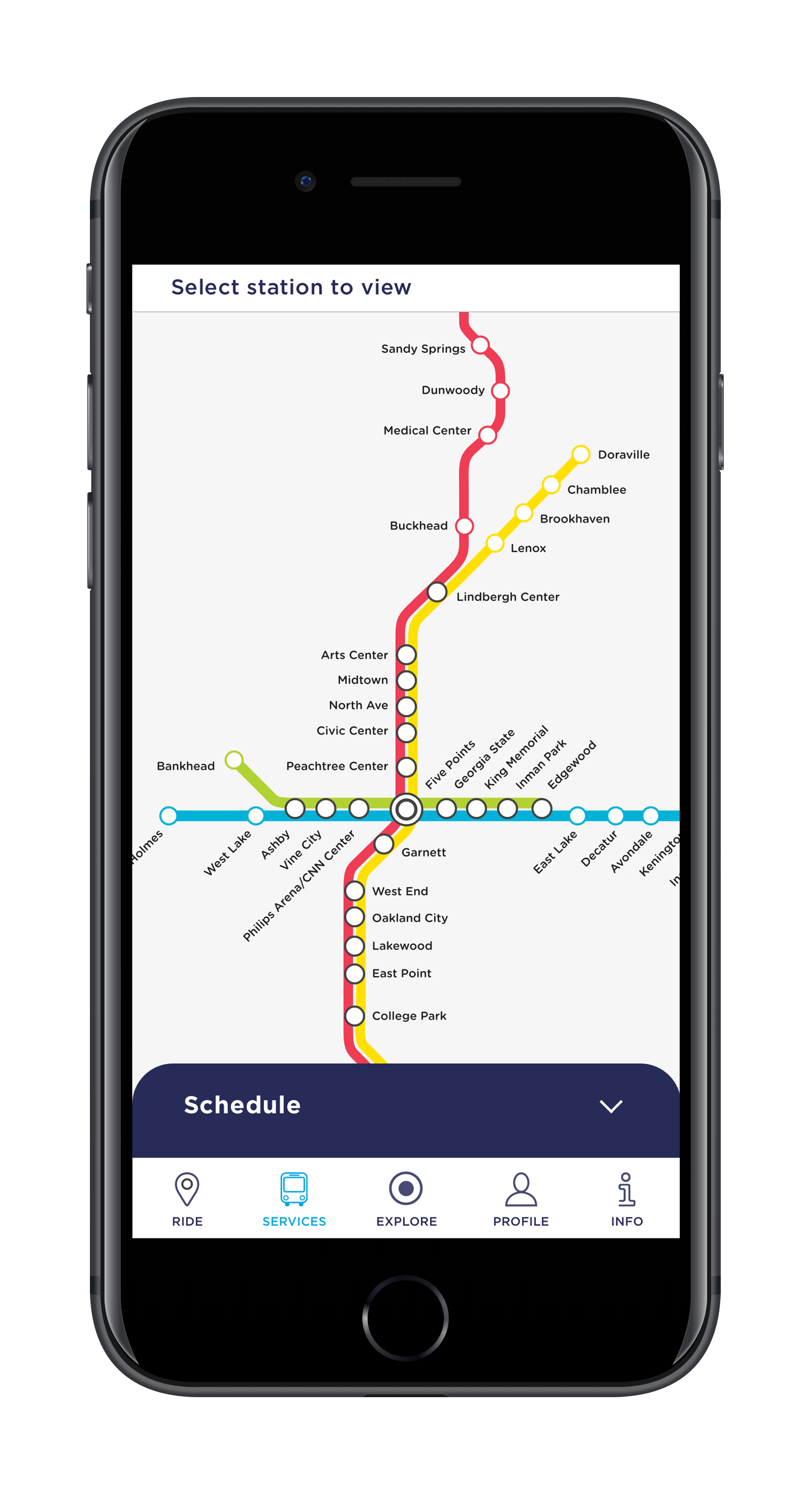
The map redesign includes color and typeface modifications to create a simpler, easier transit map for users. MARTA's current typeface is changed from Helvetica Neue to Helvetica Rounded in order to improve legibility while still being loyal to MARTA's identity. The rounded, more friendly typeface, along with the bright hues of the new color palette evoke a more inviting transit experience for users.
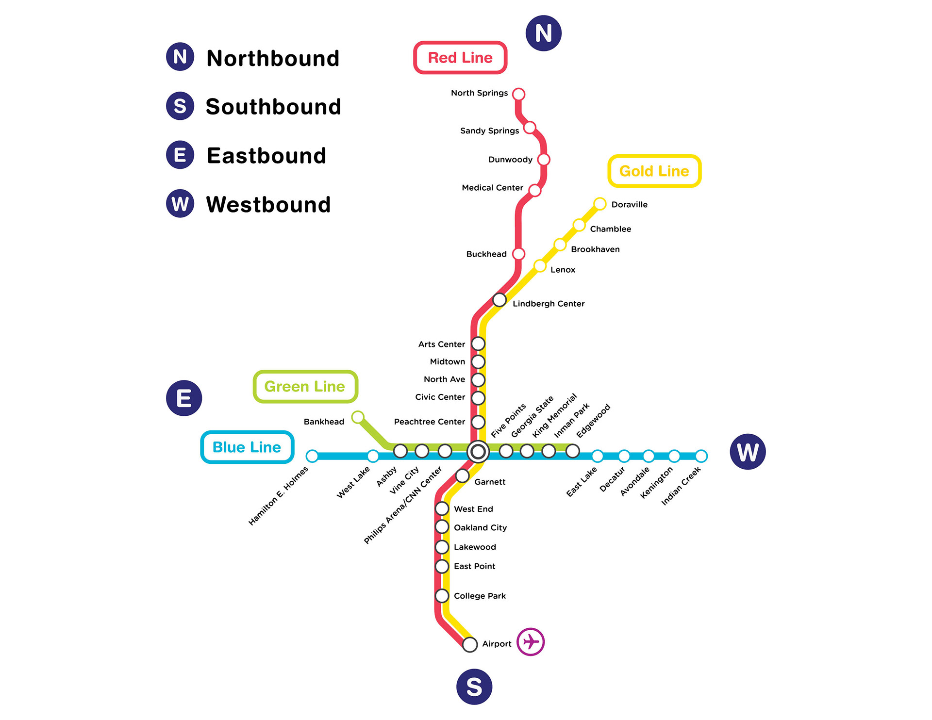
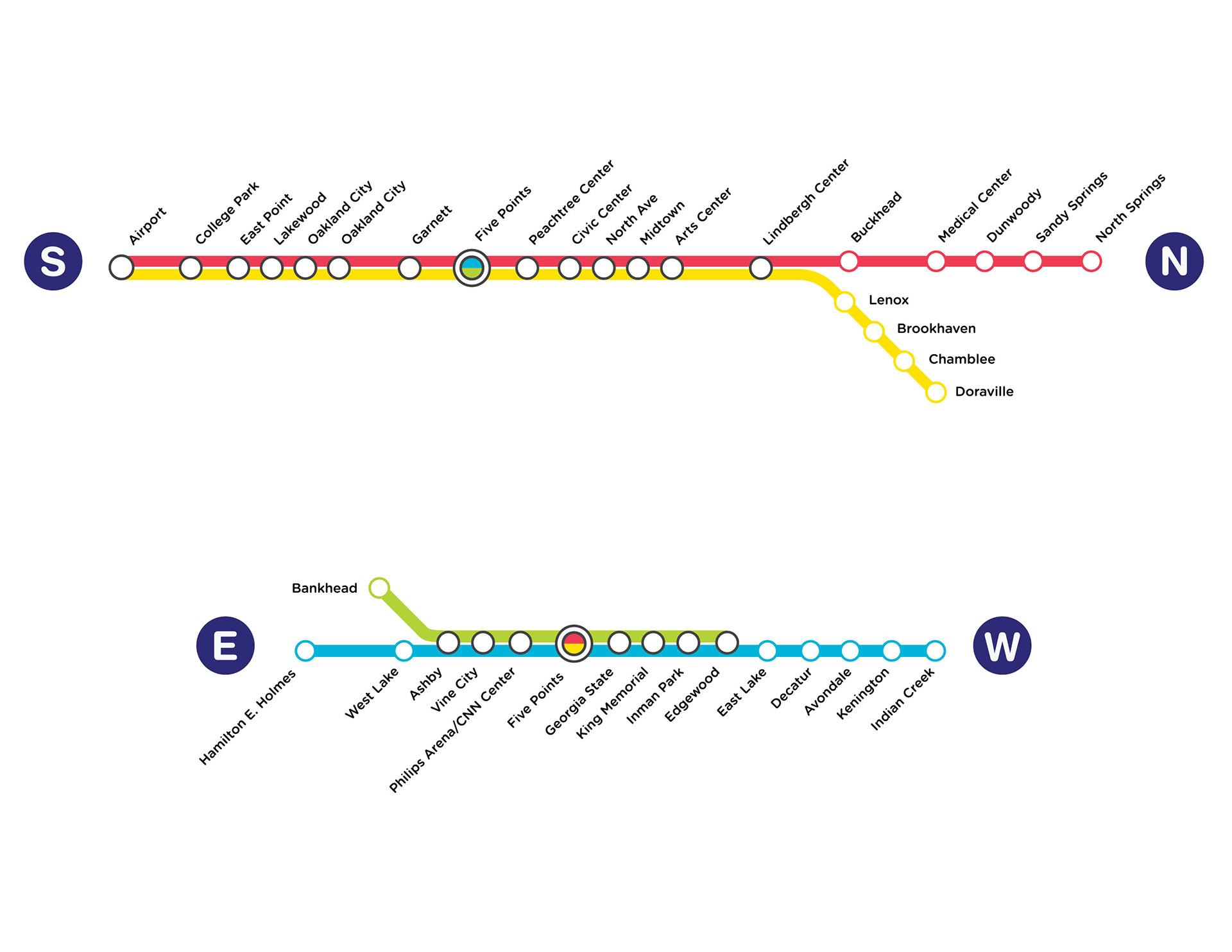
Horizontal transit maps separate the Northbound/Southbound and Eastbound/Westbound lines for quick, easy viewing. Simplified horizontal maps are more straightforward and include less transit stop information, making it easier for users to read and identify MARTA stops.
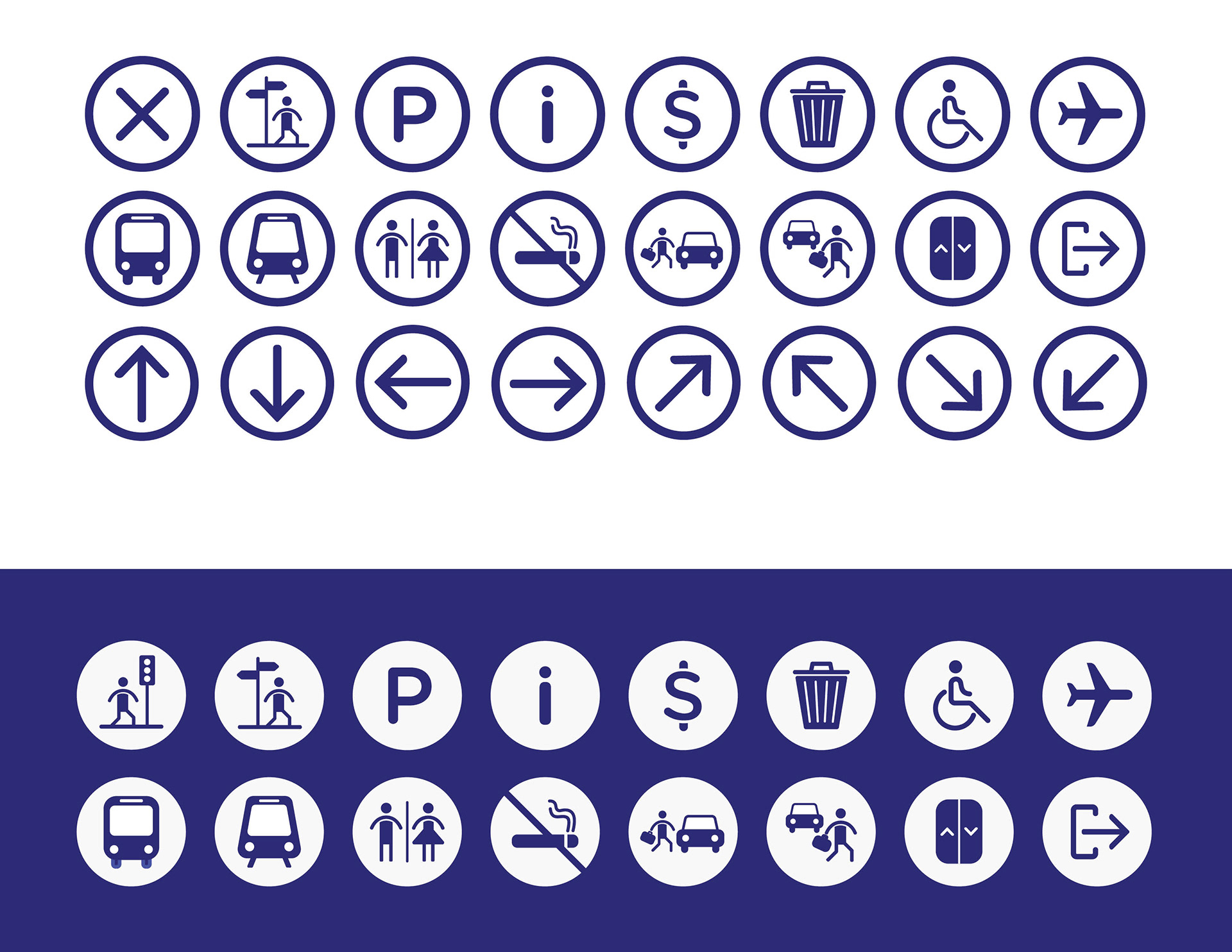
Iconography
Iconography is a crucial piece to any public transit system. MARTA's iconography uses color, line, and shape in order to create cohesive set of transit icons. Each icon incorporates soft edges to reflect MARTA's friendly and approachable identity. Filled shapes allow for icons to be identified from afar quickly and easily.
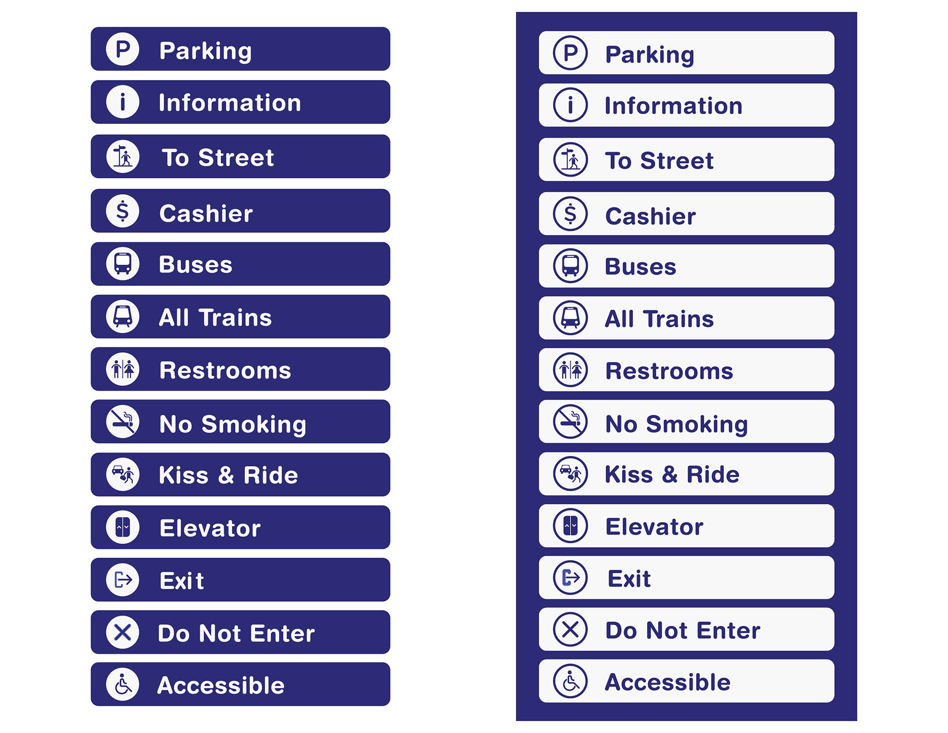
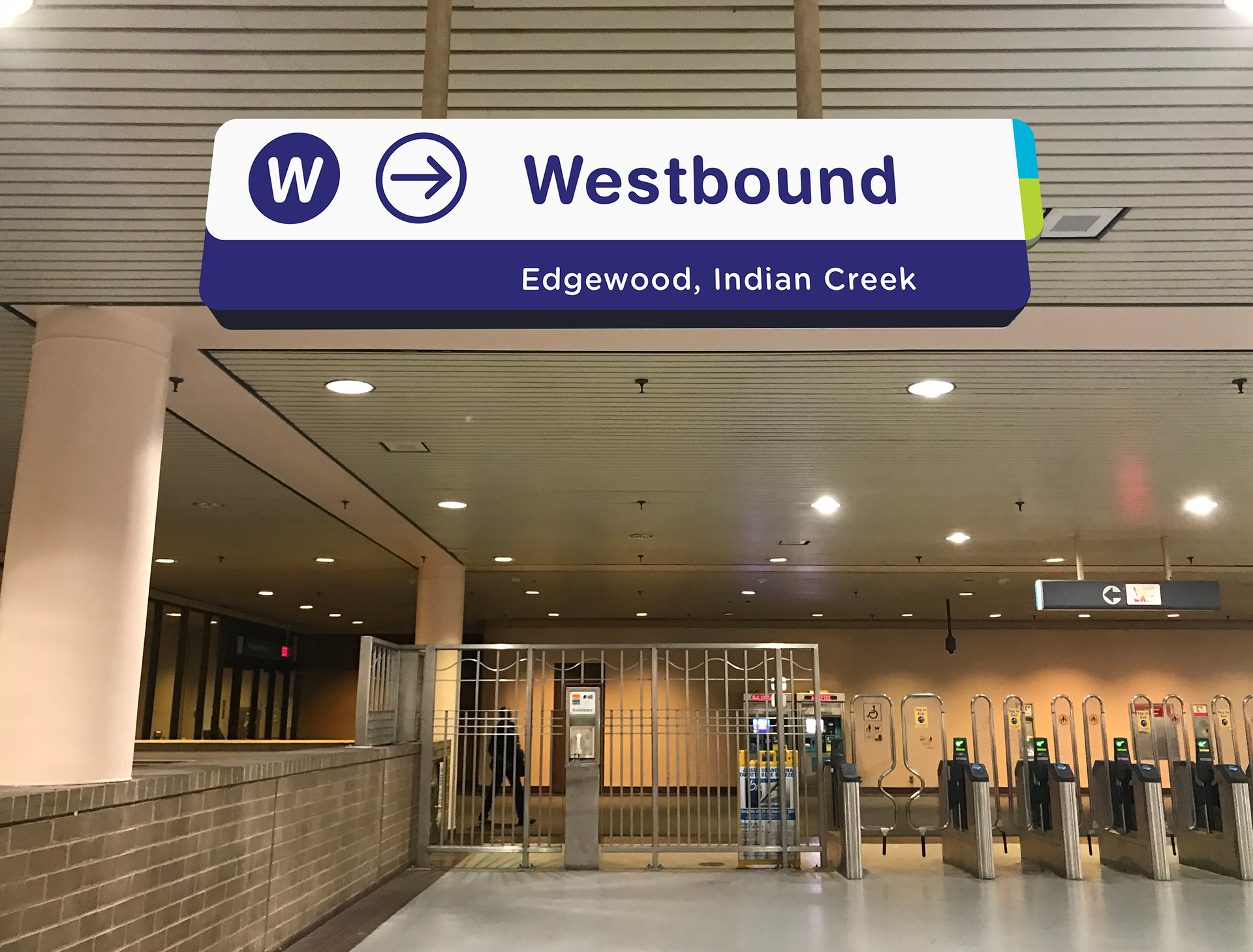
Signage & Wayfinding
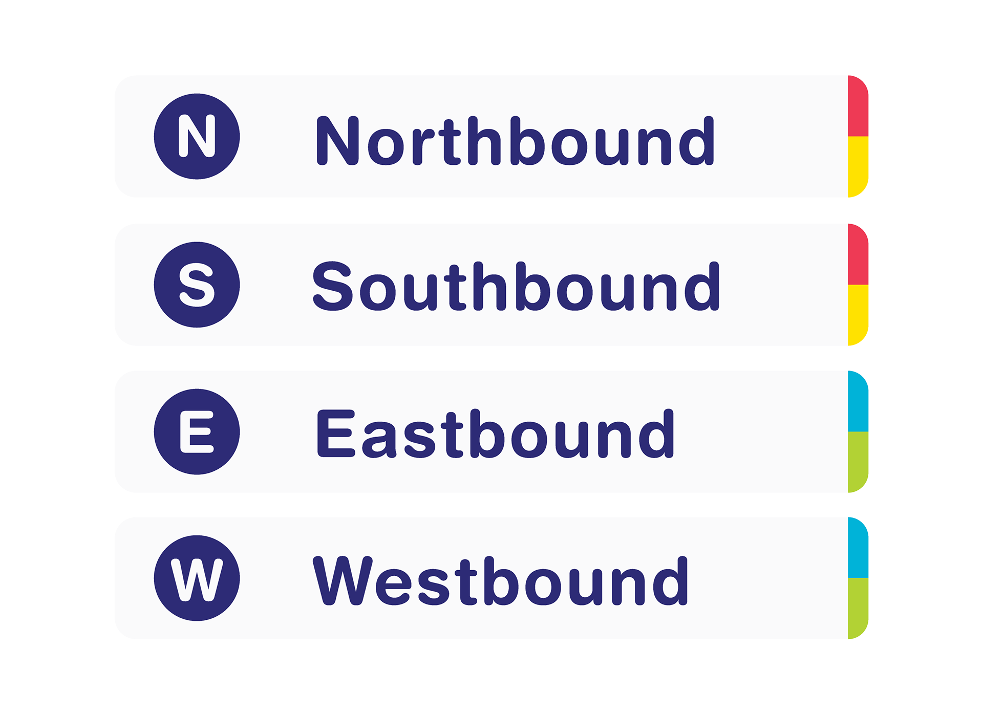
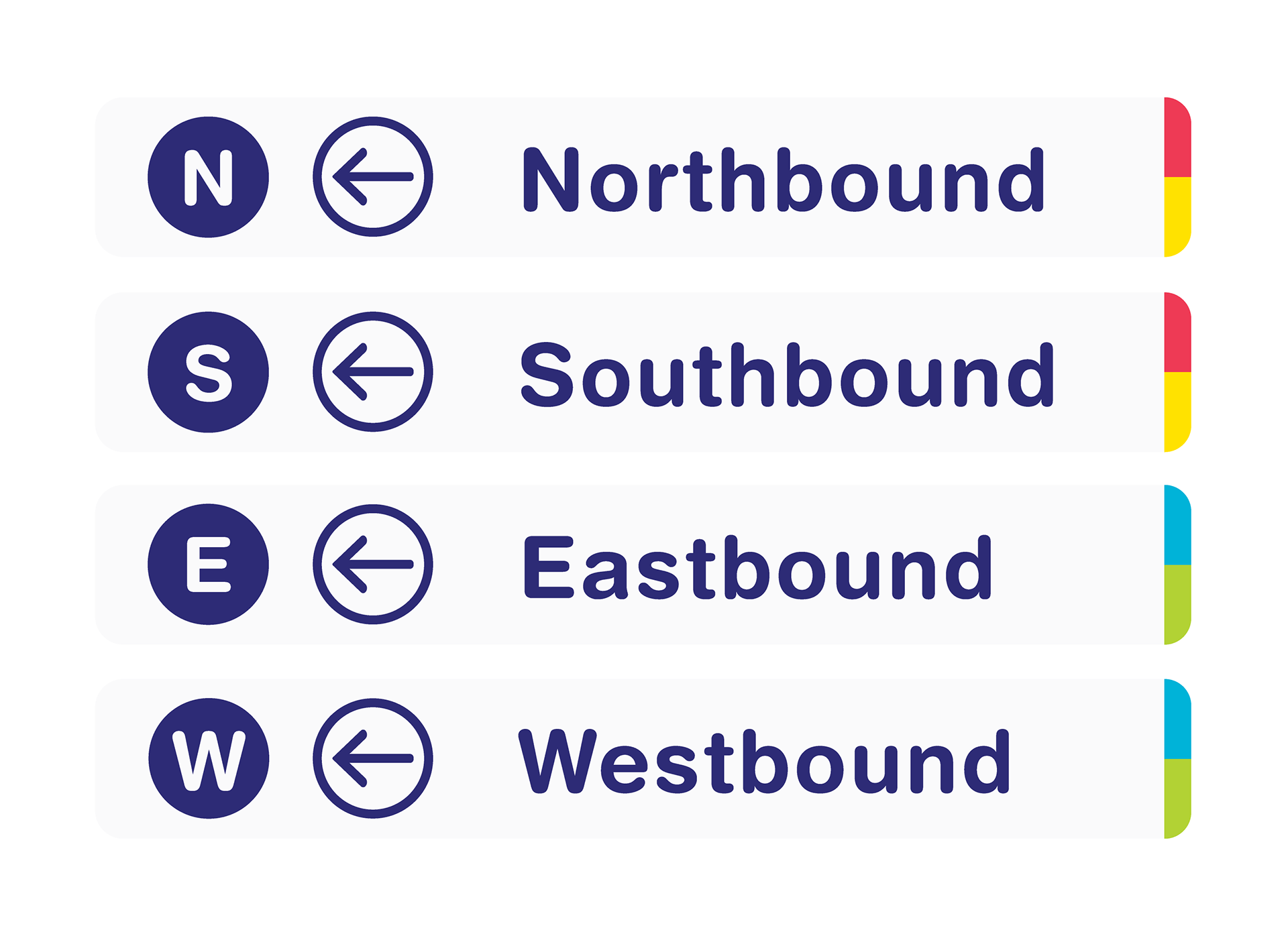
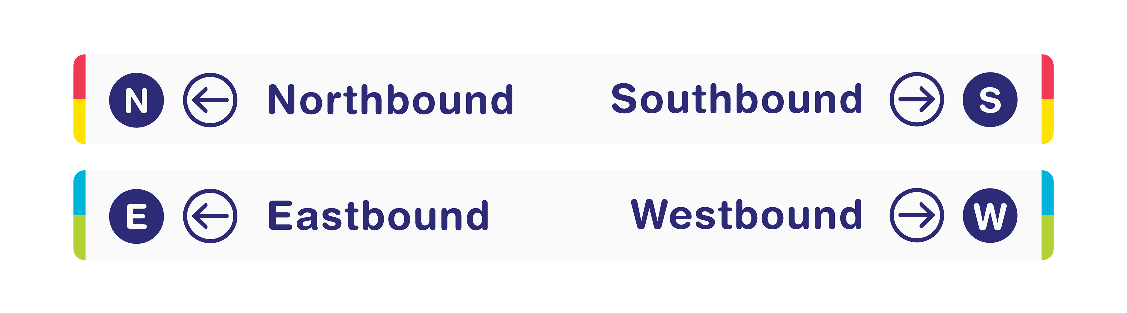
The signage and wayfinding redesign introduces clear, legible signage that reinforces MARTA's inviting and friendly identity. Transit line colors are placed on the edge of the sign, creating a simple design that encourages quick comprehension. The nonintrusive yet prominent color placement allows for users to easily identify, understand, and follow signage. Transit lines are also represented by a blue icon containing N, S, E, or W in order to implement a quick identification system for users.
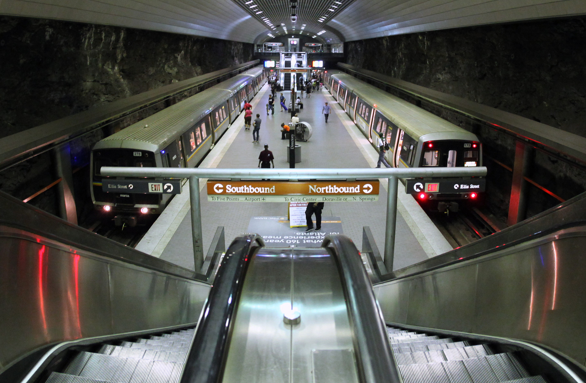
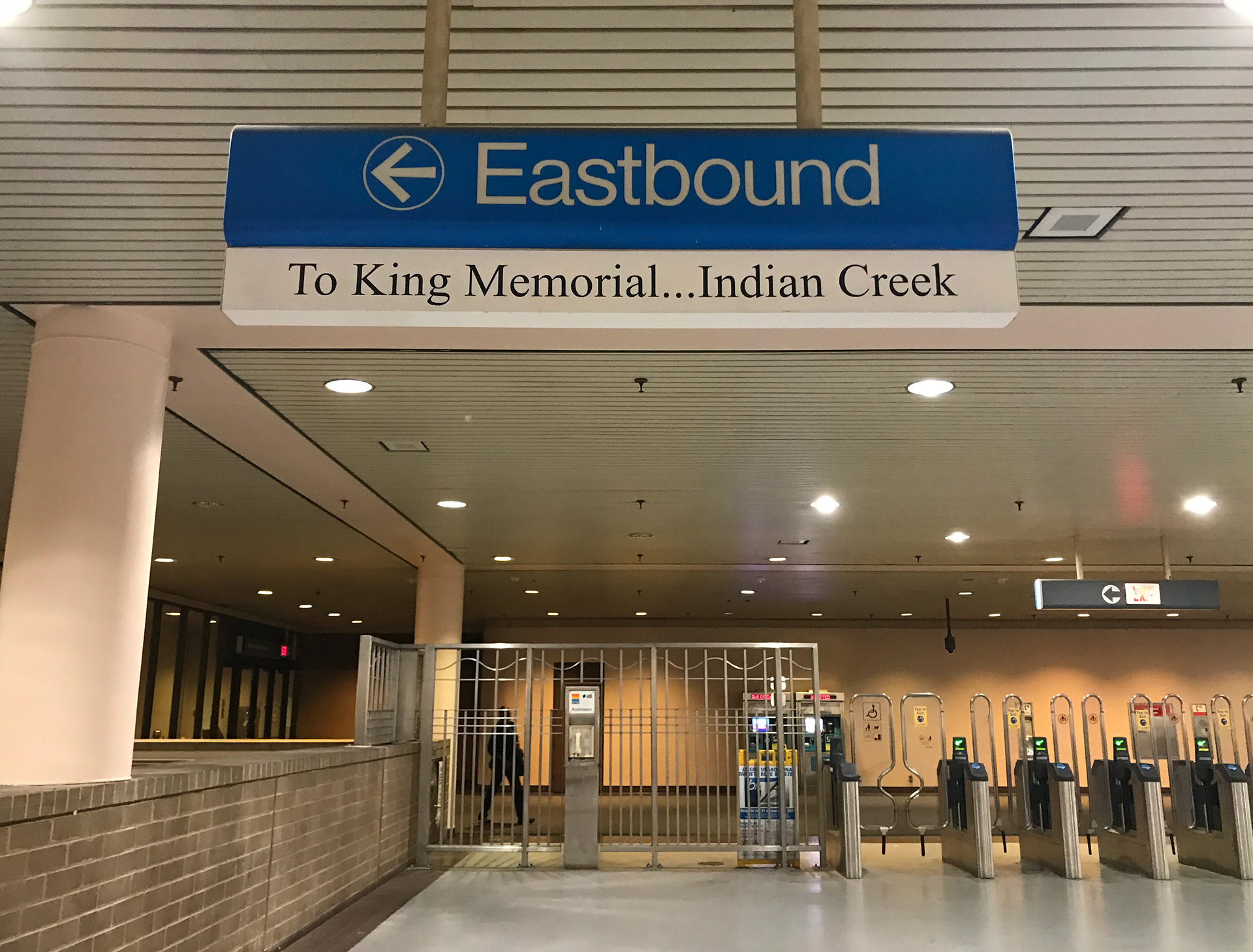
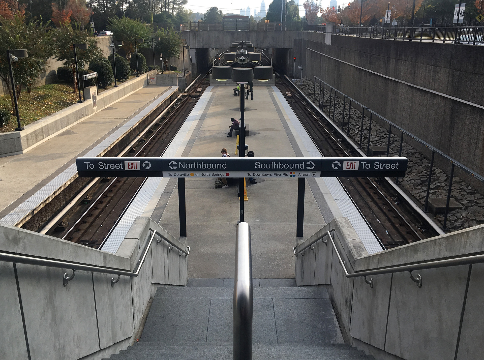
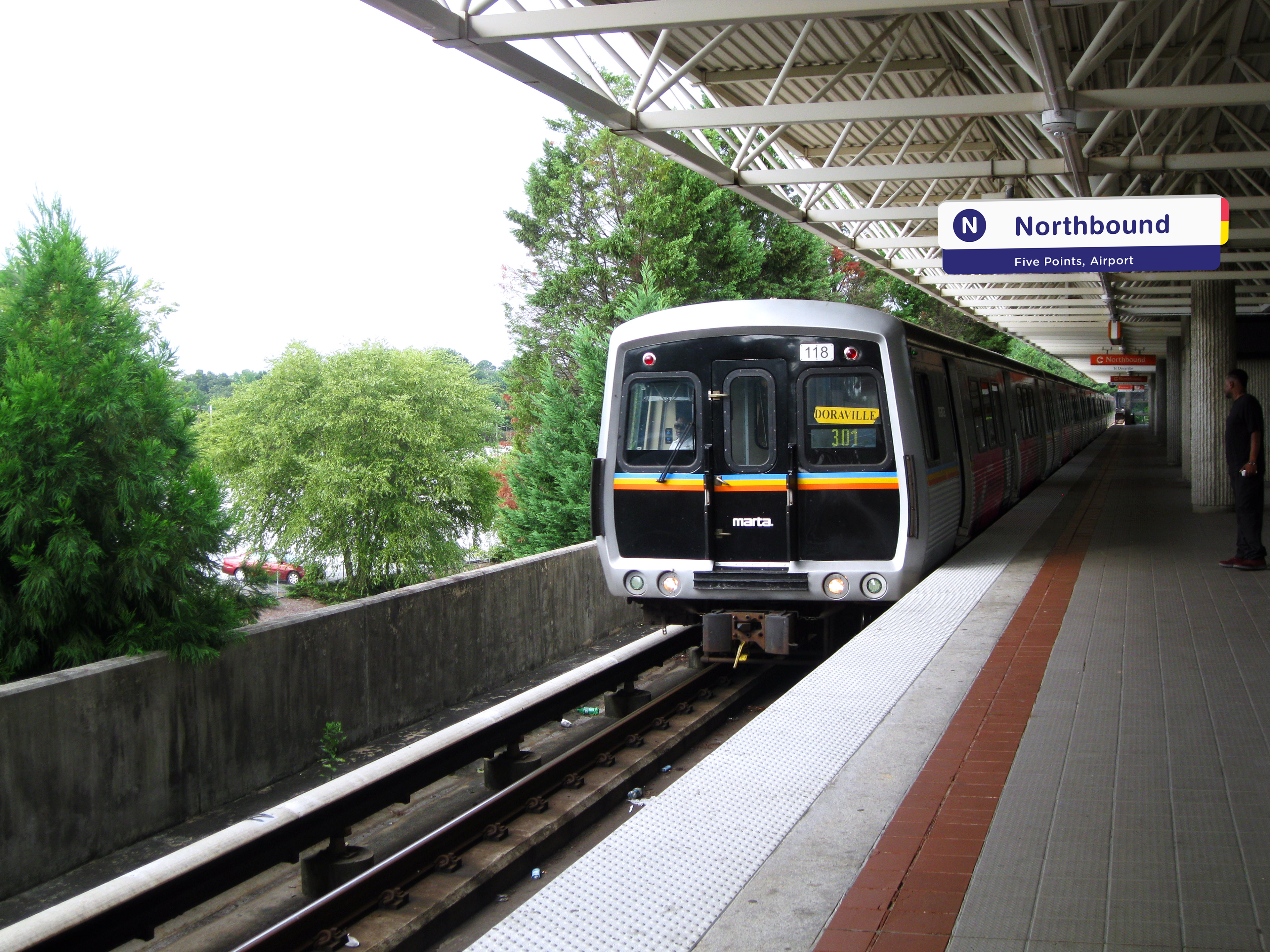
Current MARTA Signage
MARTA's current wayfinding signage is extremely dated, dilapidated, and confusing. Station signage is very inconsistent, making navigation difficult. MARTA lacks a concise signage system with attention to consistent design, particularly with color and type treatments. Because signs throughout each station often differ in color and design, users can easily get confused and lost. Additionally, legibility is an increasing issue as signs age and become more dilapidated. Many signs are faded or peeling apart, making them difficult to read and creating a stressful transit experience for users.
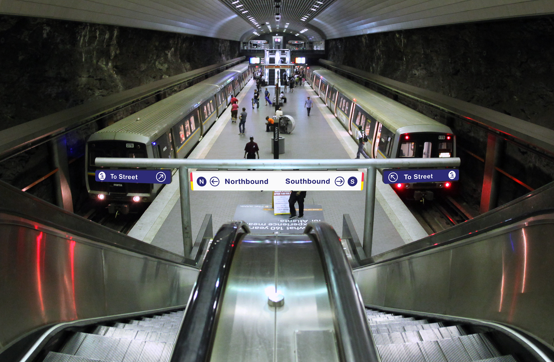
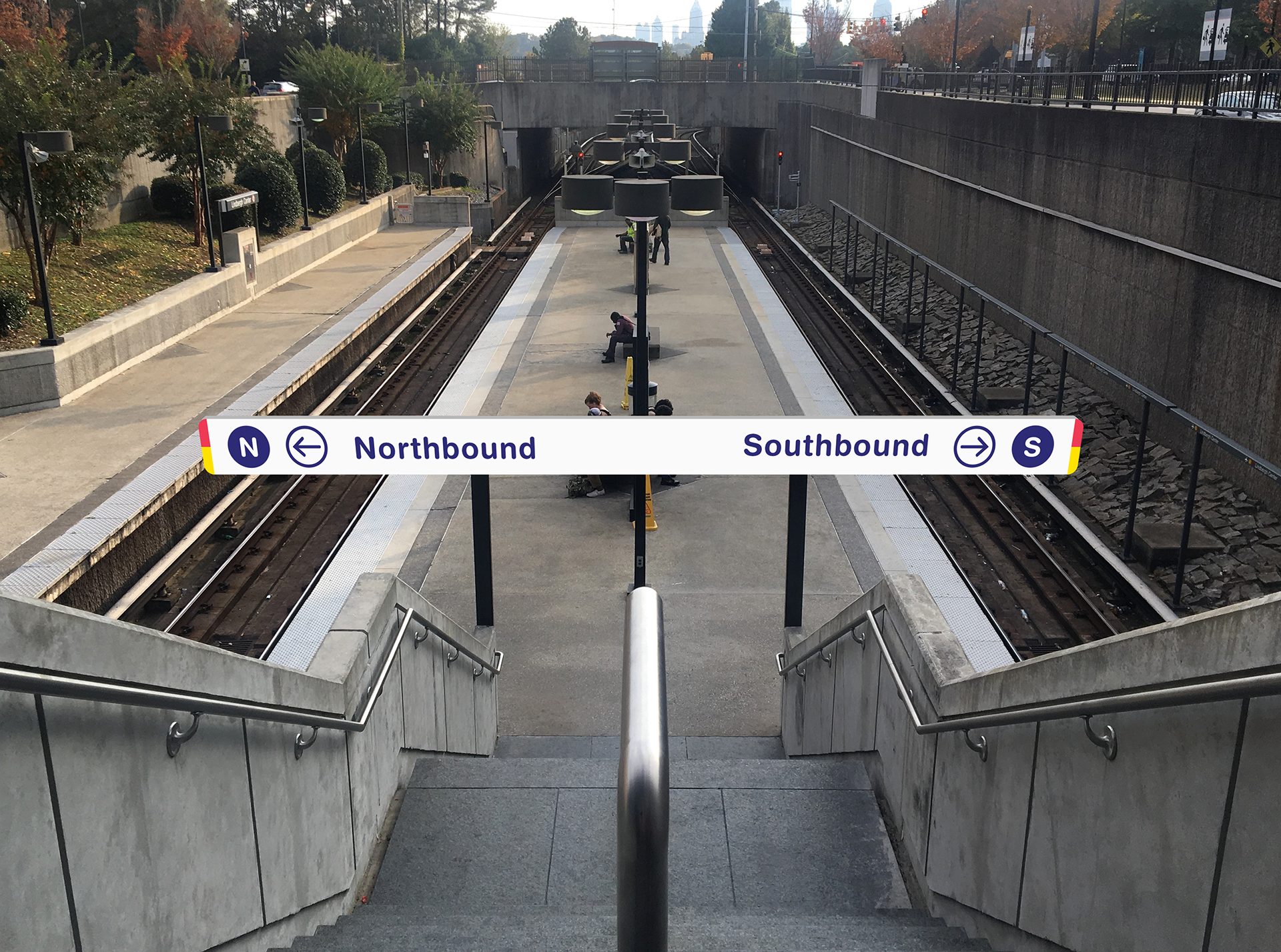
Revised Signage
Revised signage provides consistency throughout MARTA's wayfinding system. Signs are simple, legible, and easy to understand. Consistent design allows for quicker identification and comprehension among users, making transit navigation significantly easier and less chaotic.

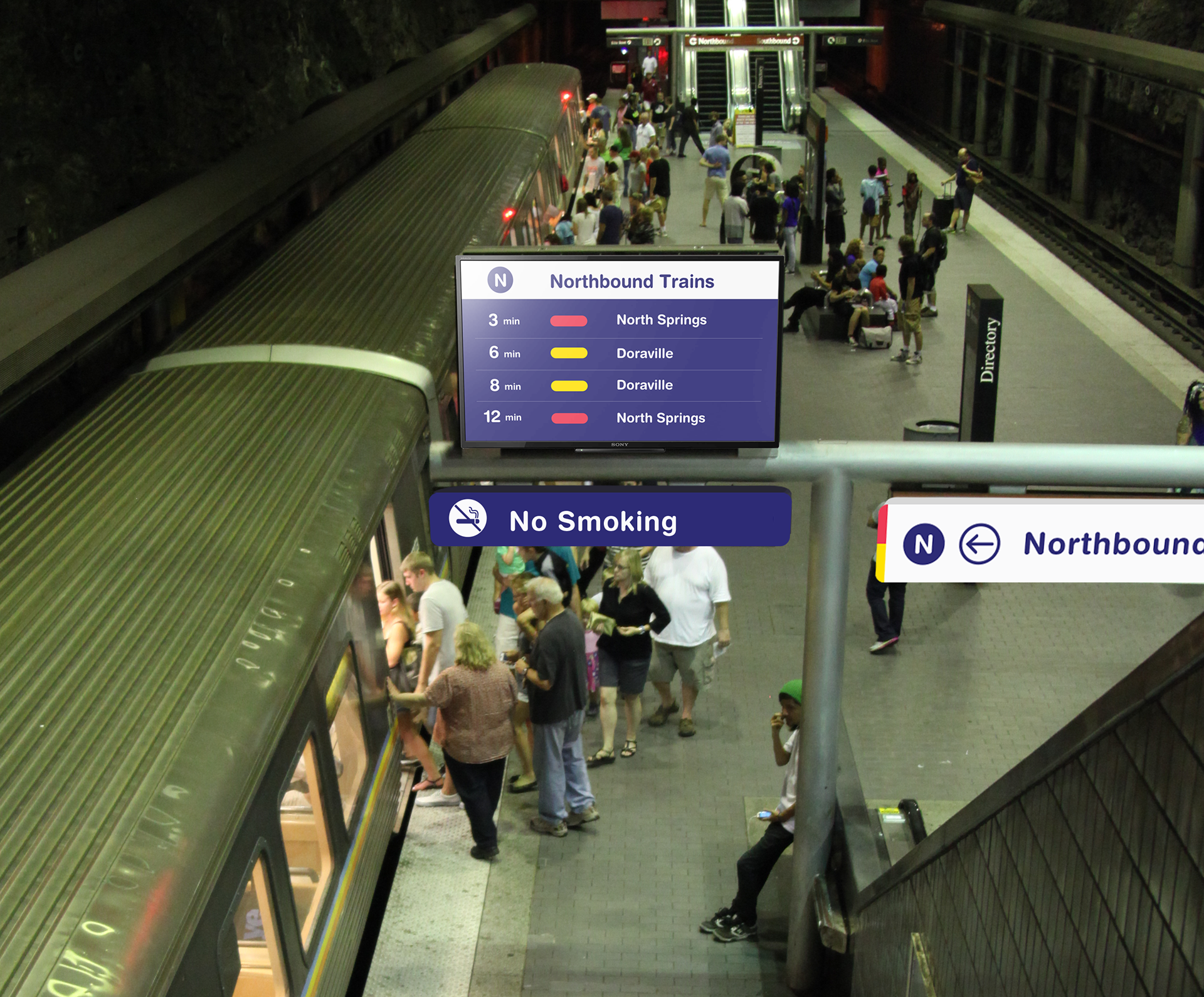
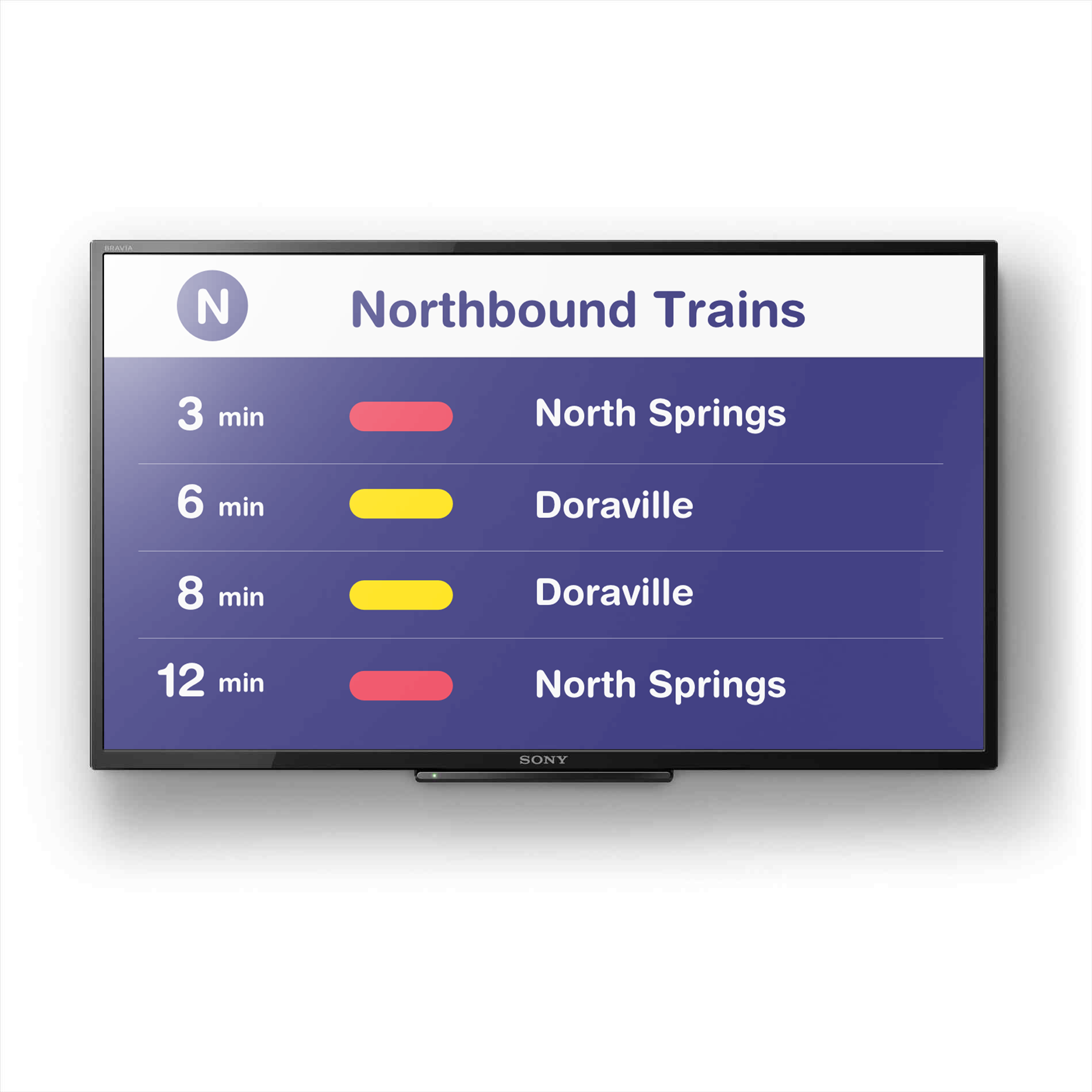
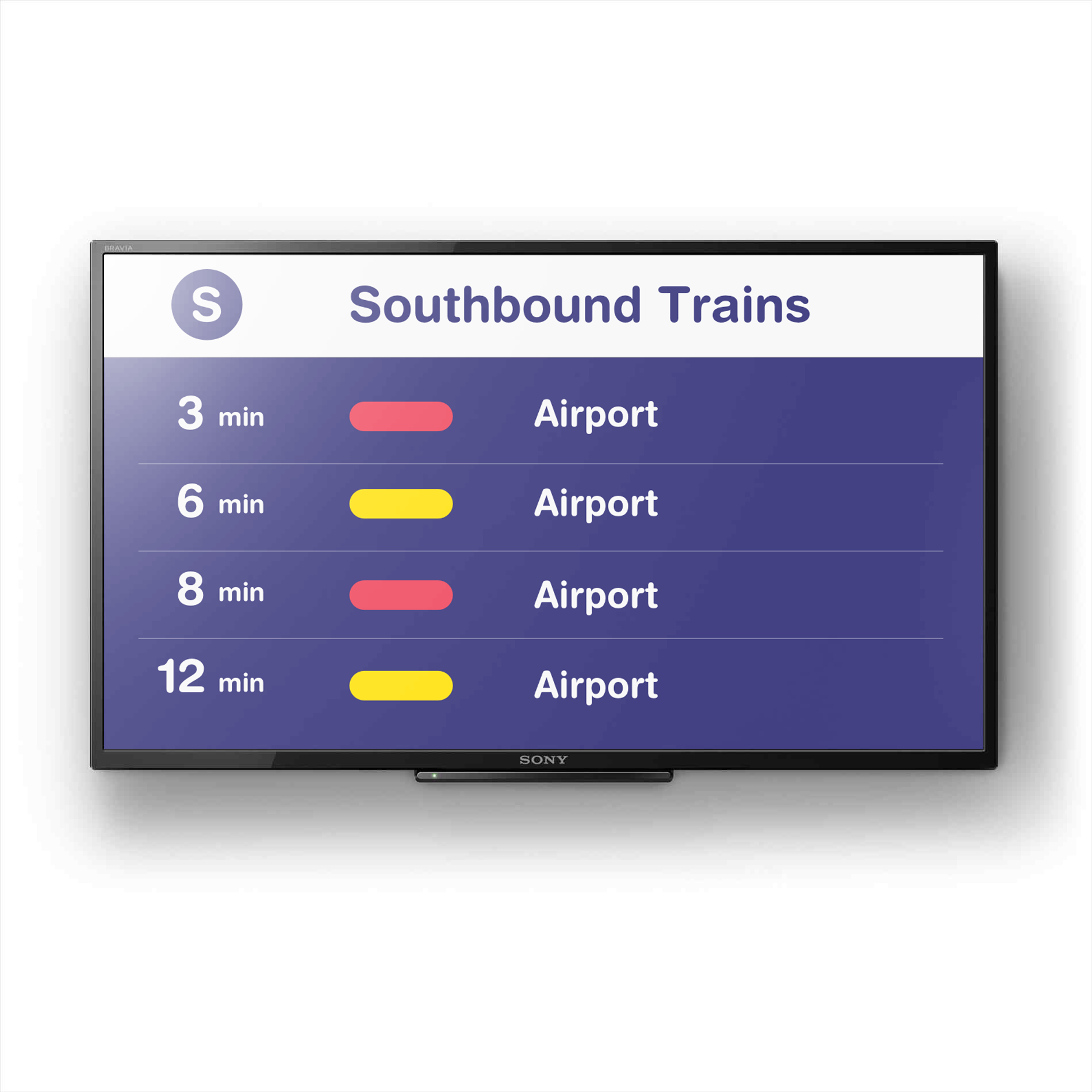
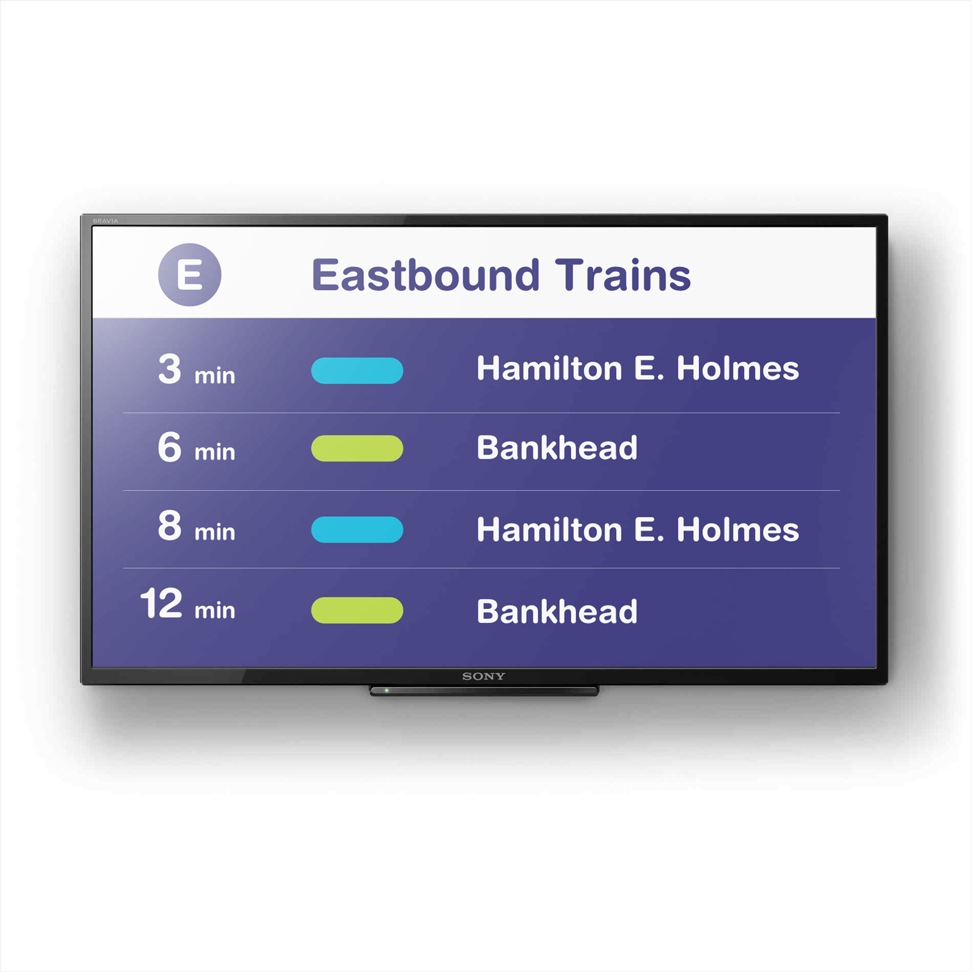
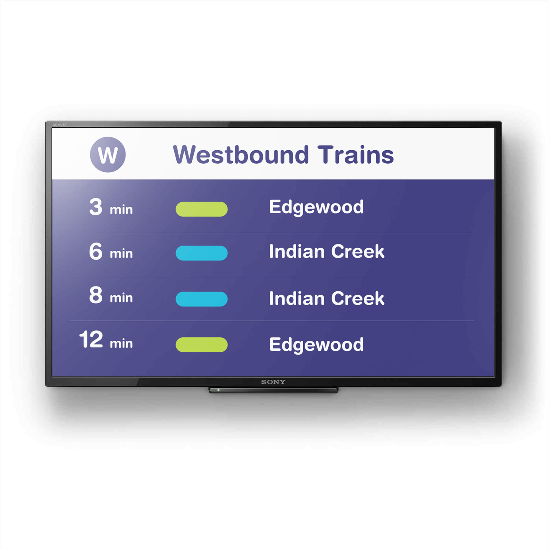
Platform Screens
MARTA platform screens display arrival times of all incoming trains. Time until arrival is placed on the lefthand side of the screen for quick comprehension. Each line is also represented by a colored oval, allowing users to quickly identify incoming trains. Platform screens are continually updated to ensure users are always aware of incoming trains, creating a much less stressful transit experience for users.
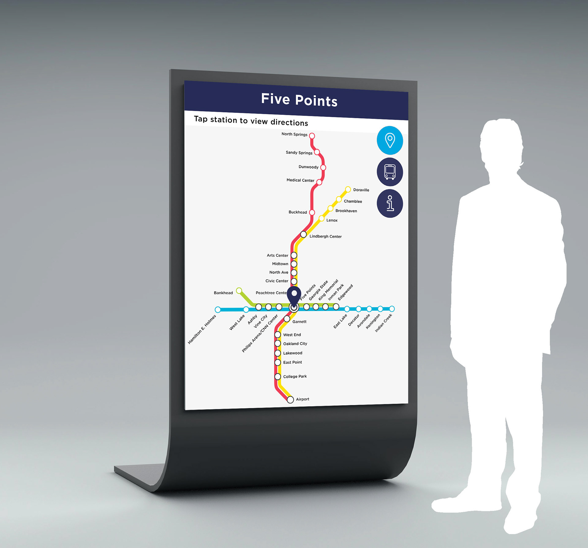
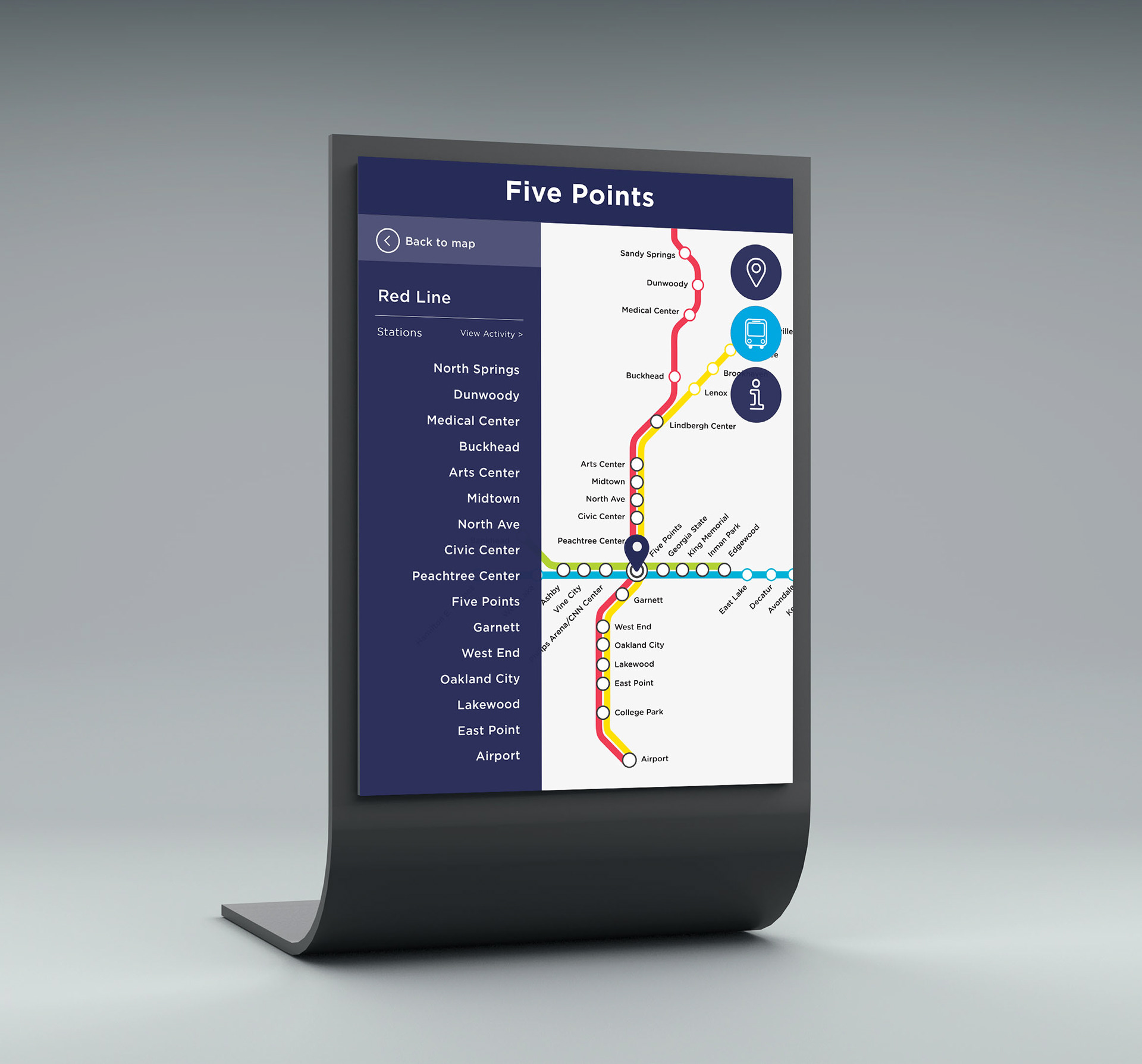
Station Kiosk
Touch screen wayfinding kiosks are located at each MARTA station. The interactive navigation kiosks provide directions to destinations, station schedules, and more transit information.
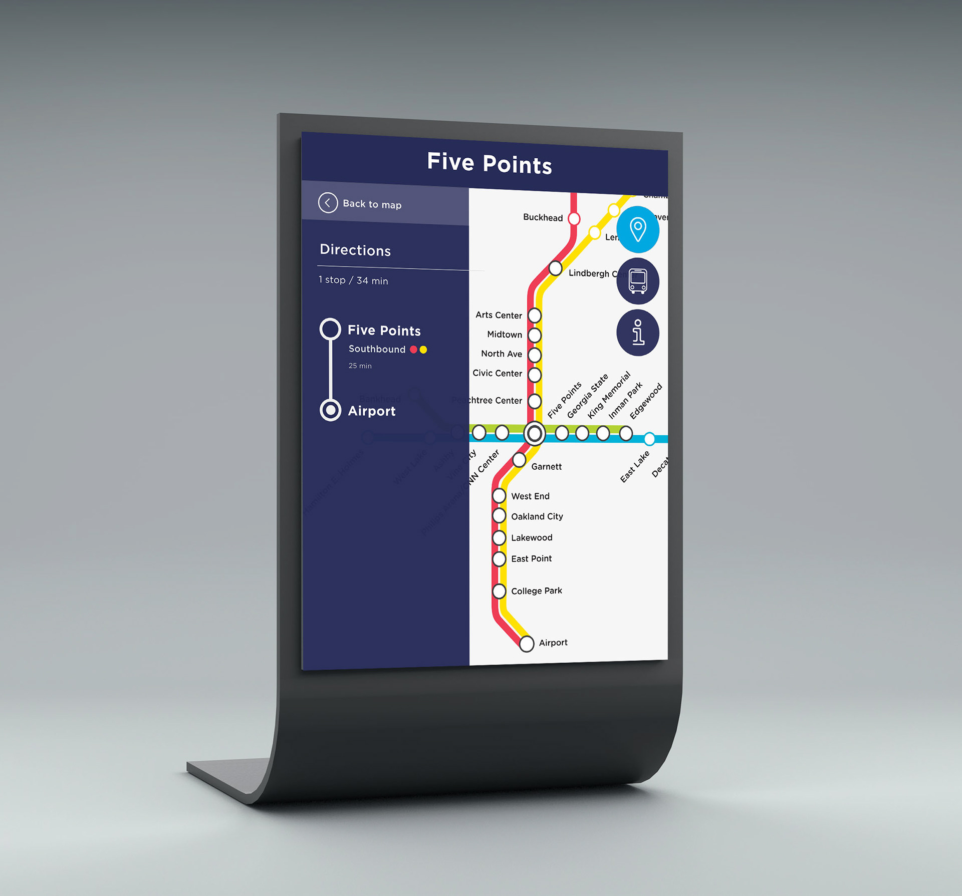
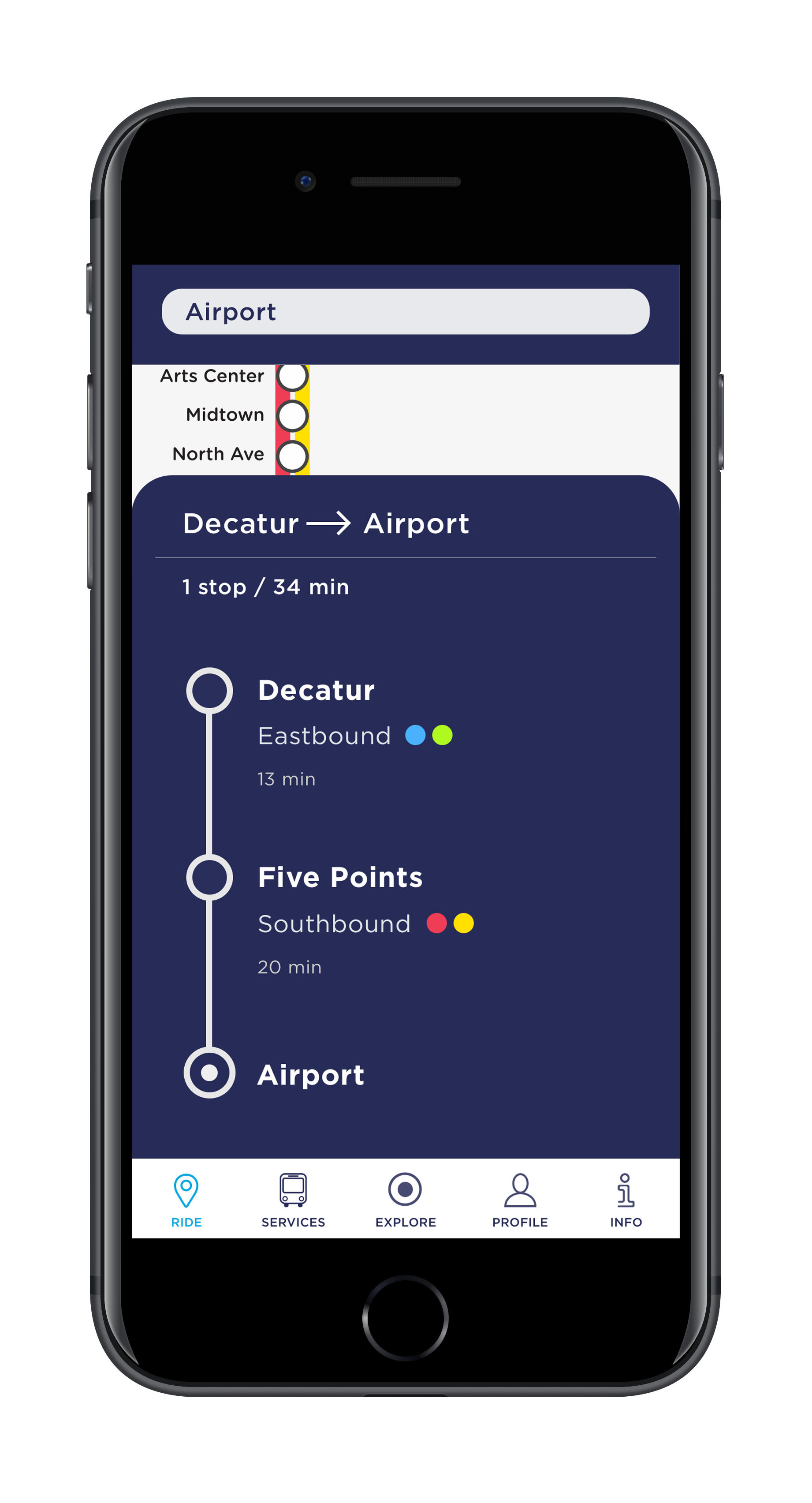
Users can tap any station on the map to instantly get transit directions from their current MARTA station location. The kiosk allows users to customize their directions by changing the start location or adding additional stops.
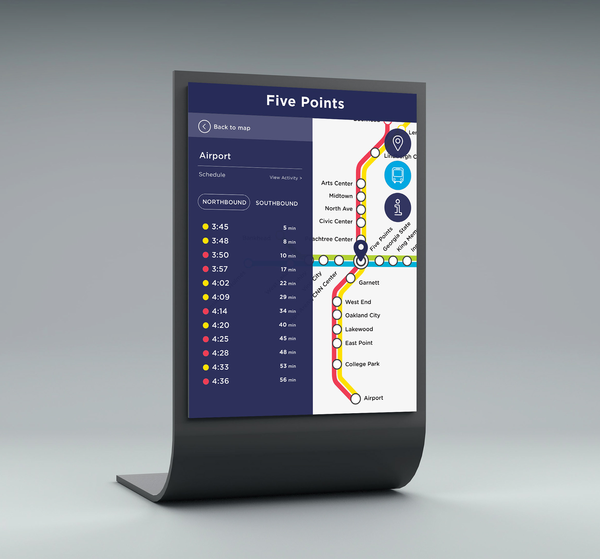
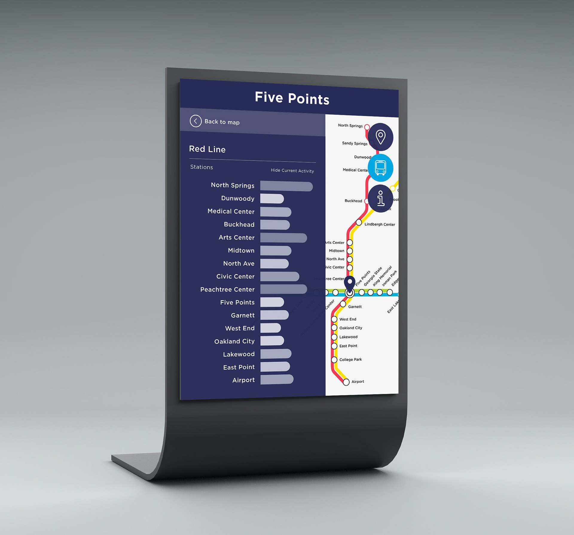
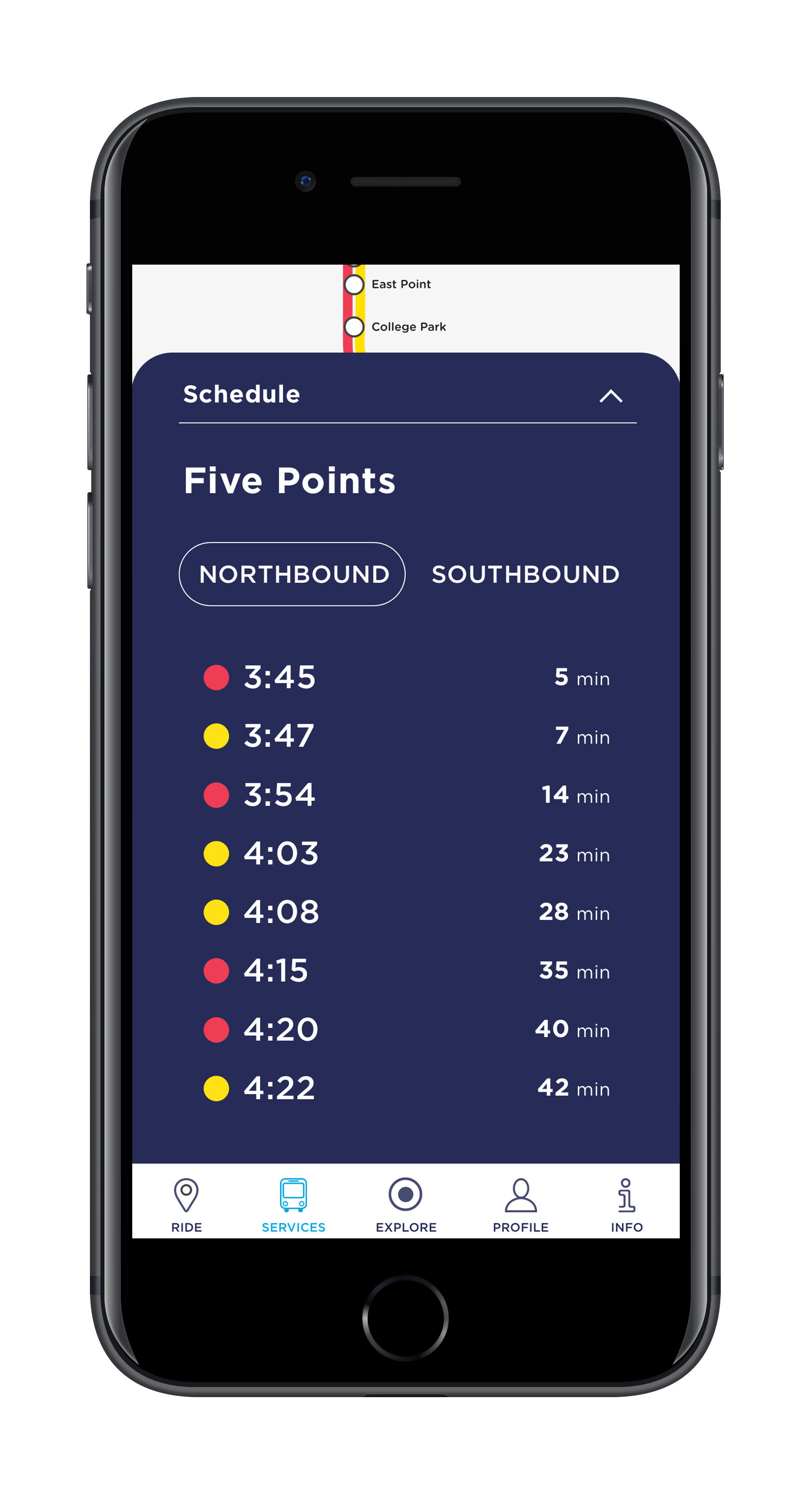
After selecting the train icon, users can tap a station to view the station's schedule and train departure times. Selecting "View Activity" visually displays real-time information about busy station times.
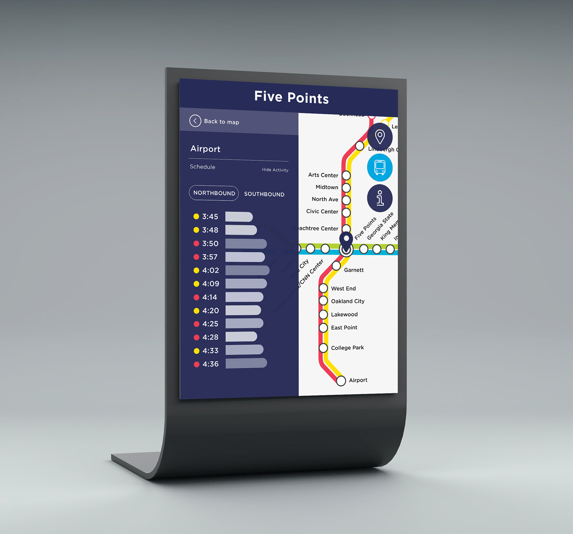
Users can also tap any transit line on the map to view a list of all the stations on that line. "View Activity" displays real-time information on the activity at each MARTA station. This shows users how busy each station is and allows them to more effectively plan their MARTA trip.
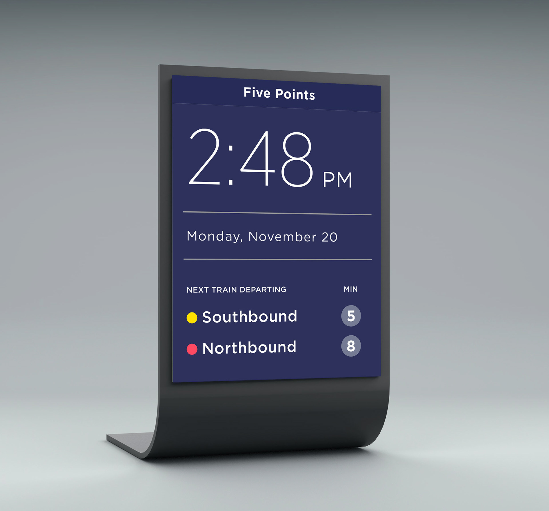
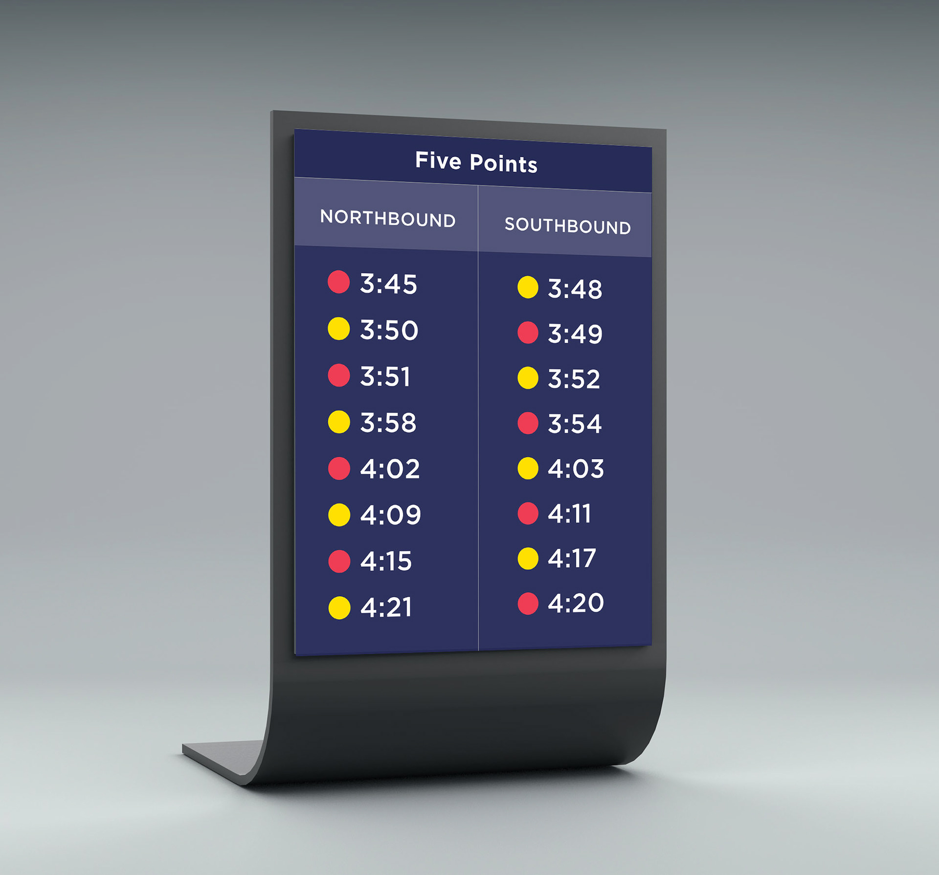
In addition to the interactive touch screen kiosk, each station also has an informational kiosk that displays departure times of all trains. The kiosk alternates between the station's schedule and and a screen containing the time and date.
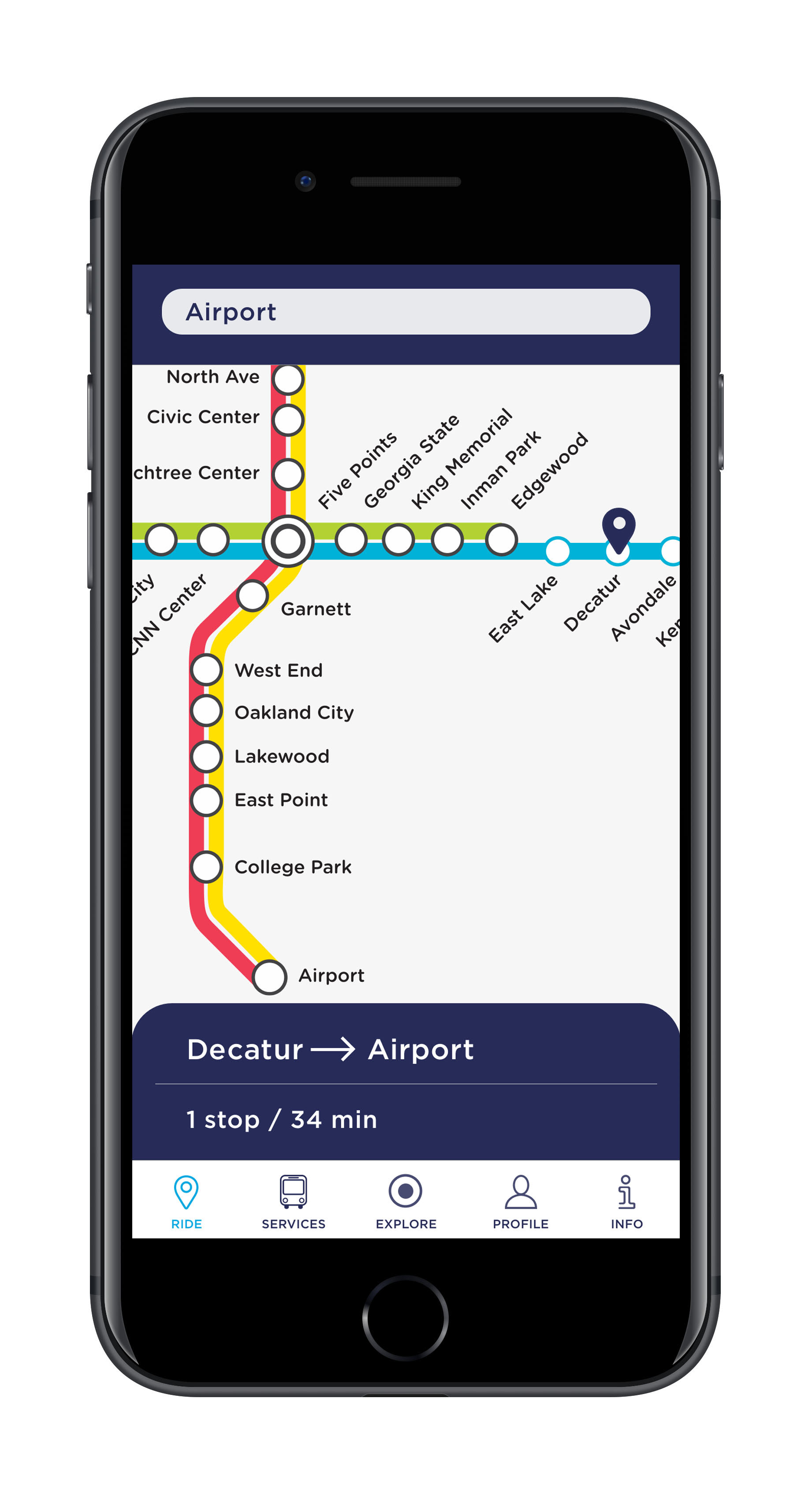
Mobile App
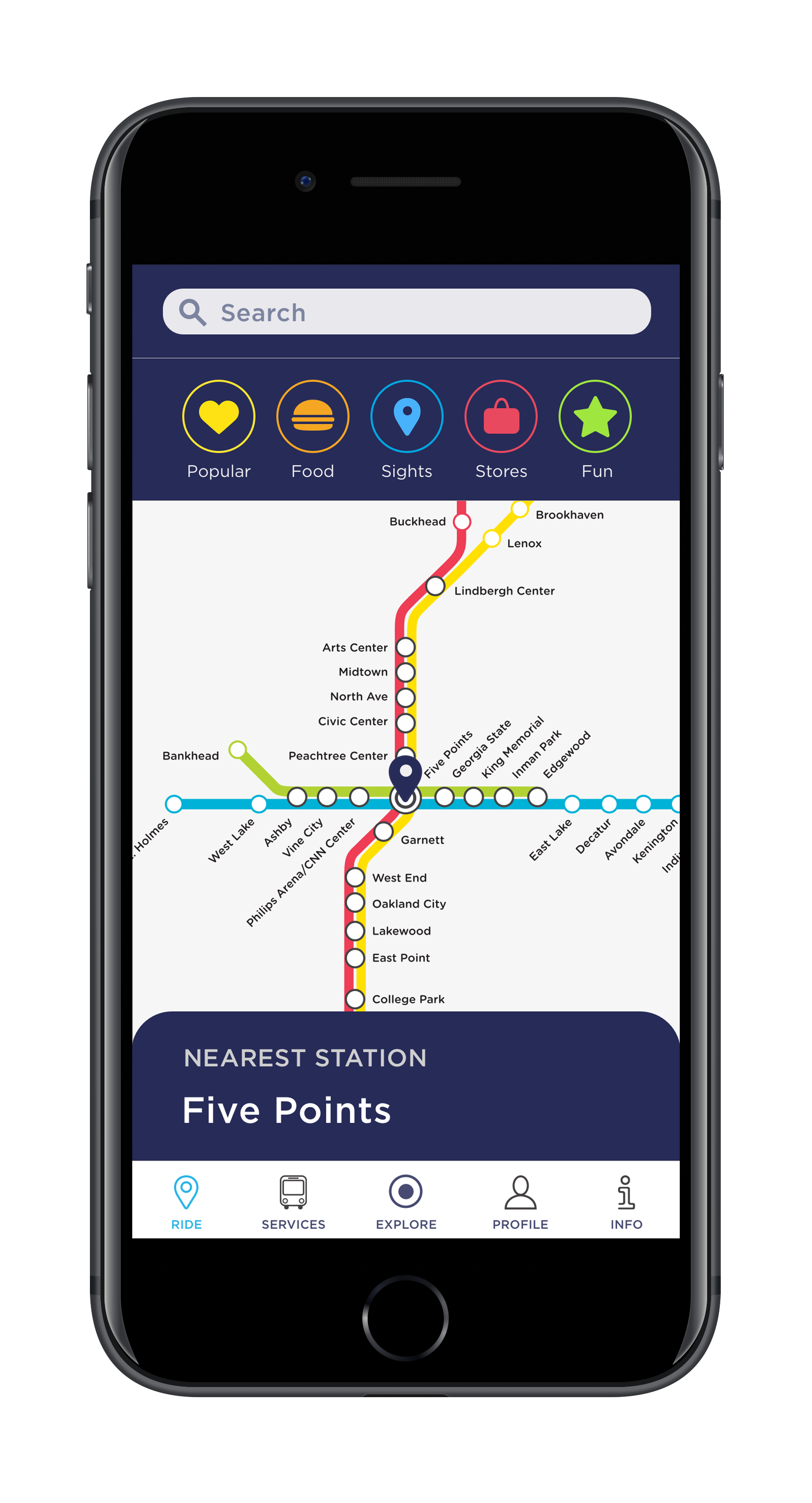
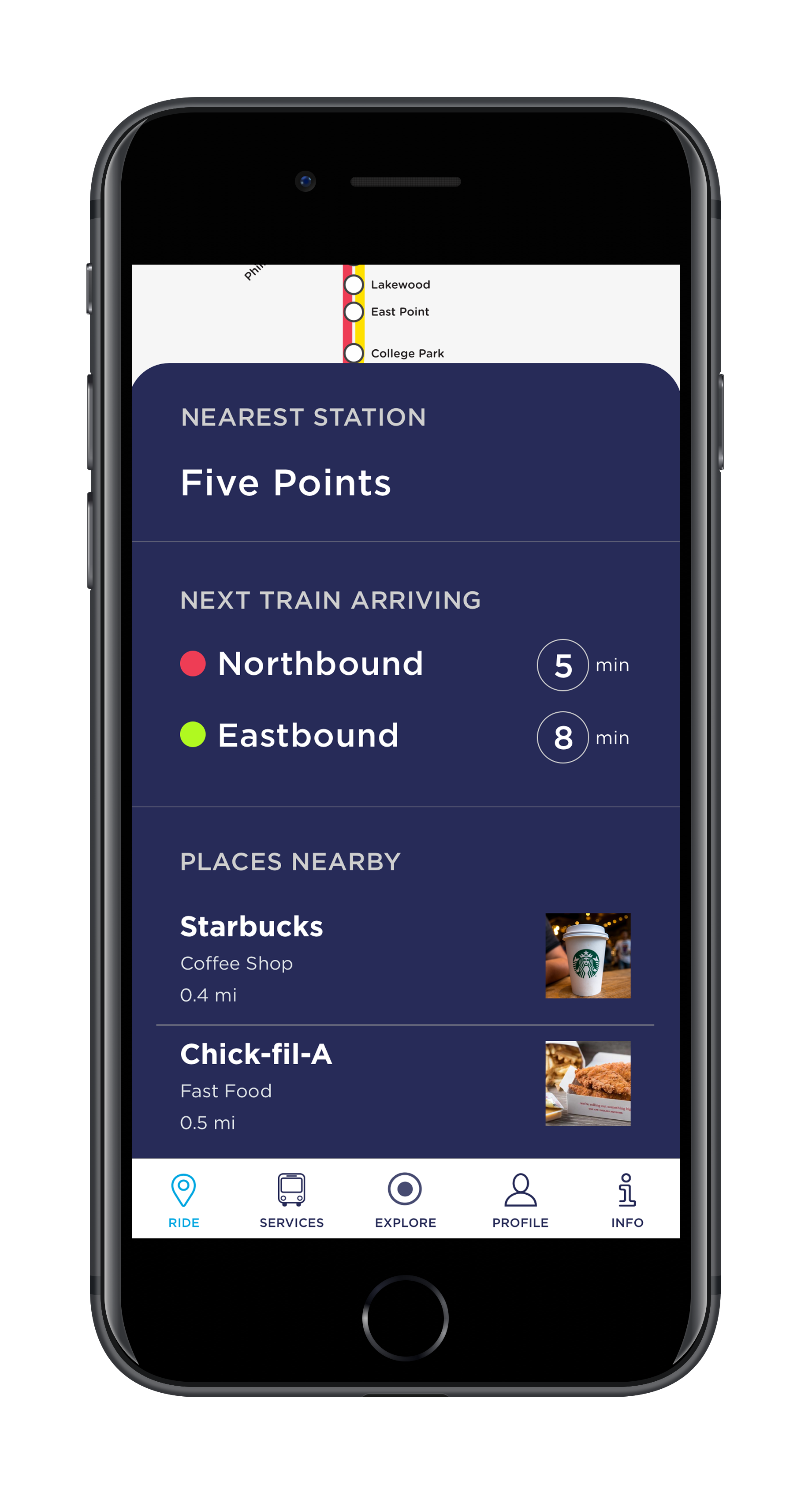
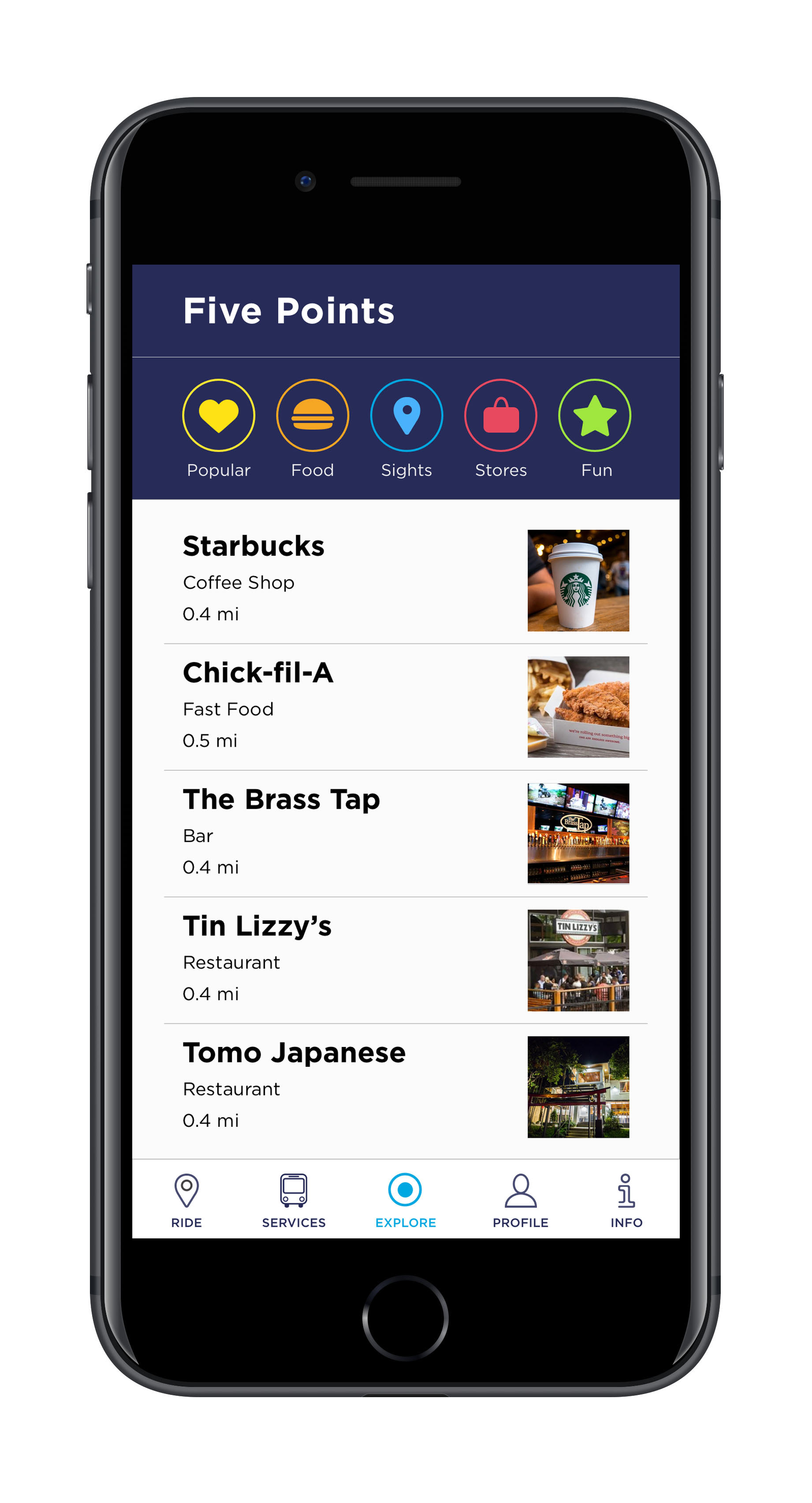
Geolocation allows users to view popular destinations near MARTA stations.
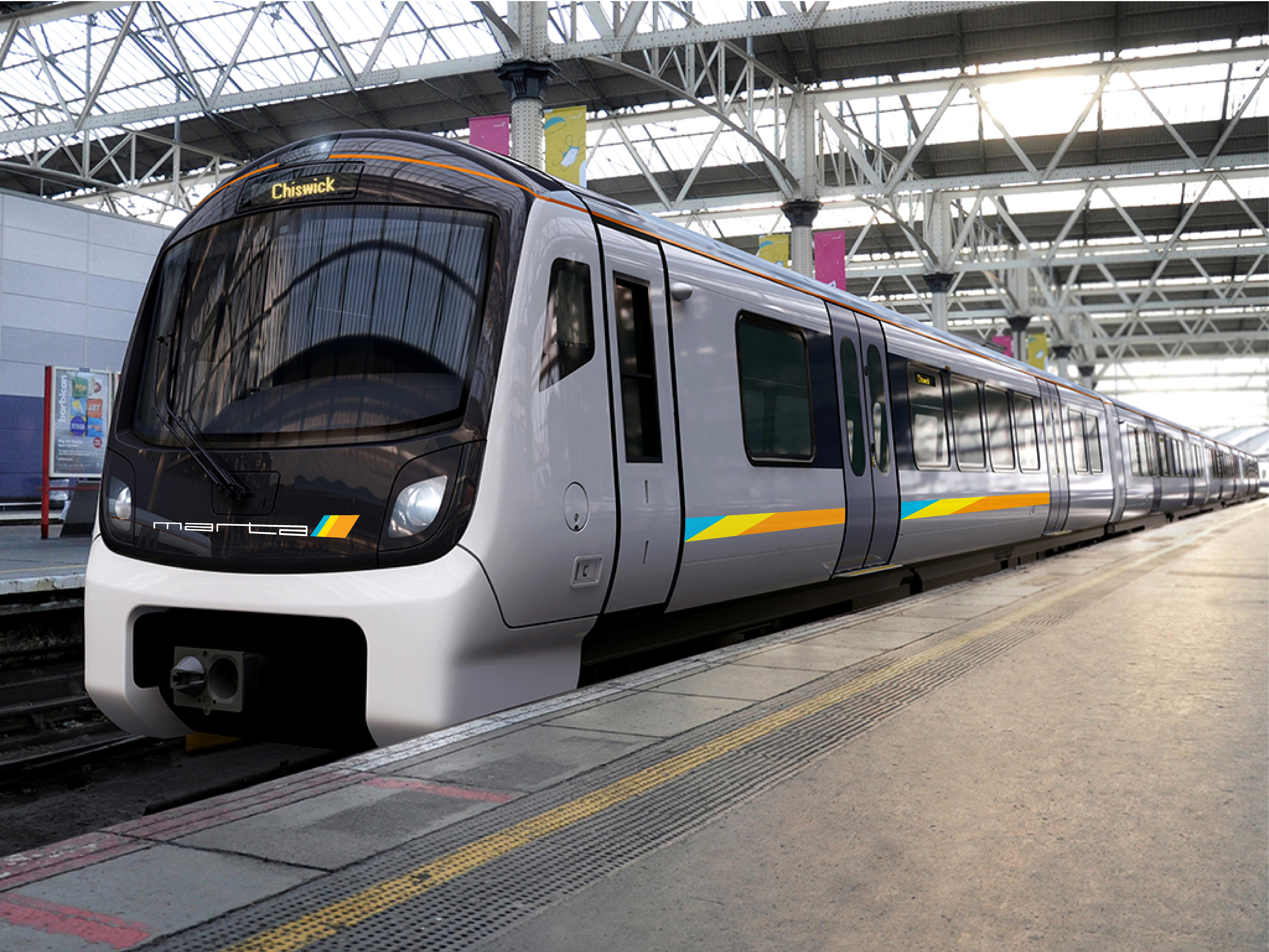
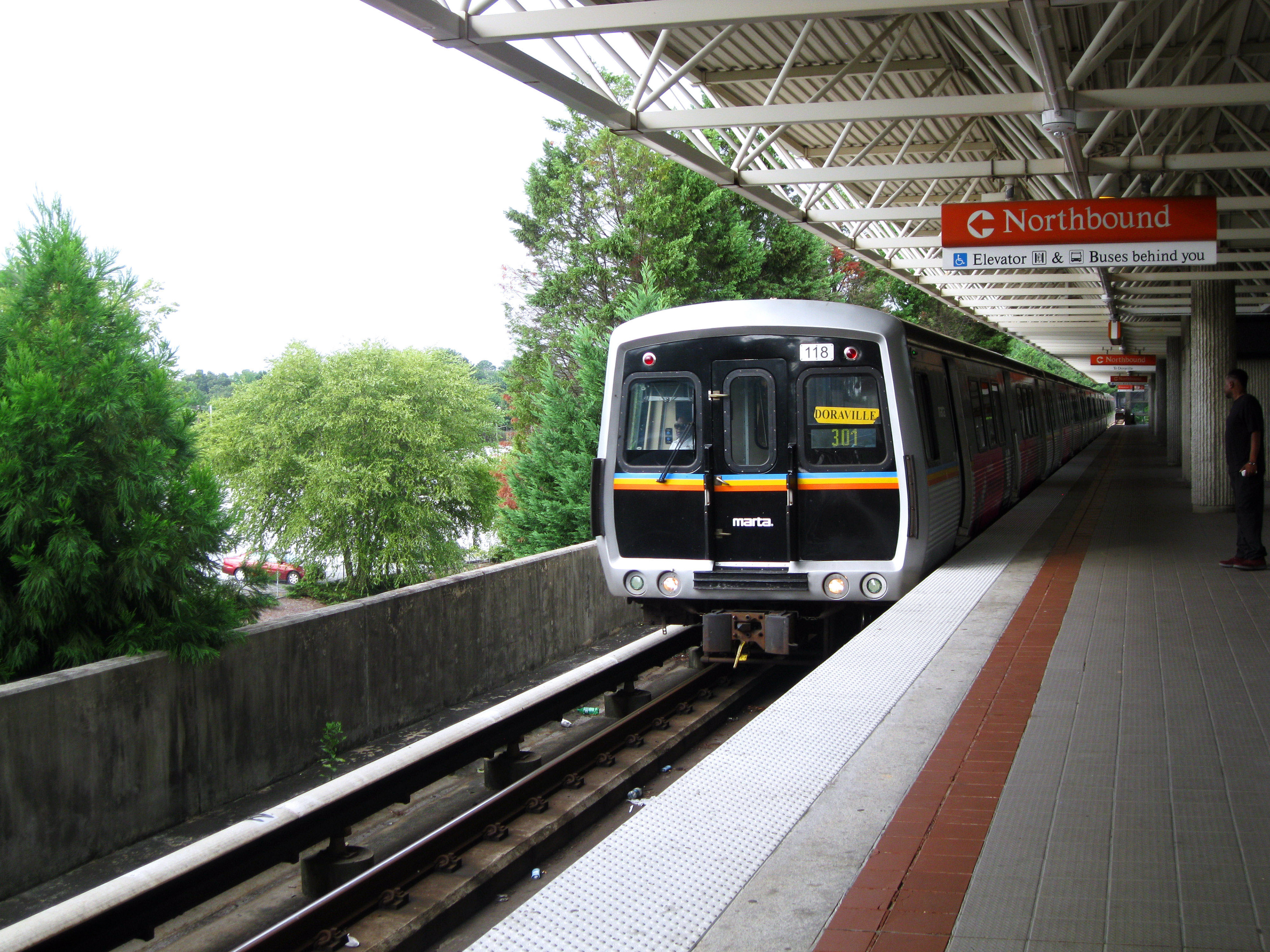
Train Redesign